It’s here!
At the end of September, Adobe released its spiffy new Photoshop Elements version 5.0! I love my current version of Elements; I had tried using “big” Photoshop, which is the super powerful program used by professionals, but found it quite a bit over my head – so I spent most of my time with “little brother” PS Elements 4.0 instead. Elements has all the tools and creative capabilities that I need, and as I’ve become more familiar with it I’ve fallen more in love with this little powerhouse of a program. And now I’ve managed to get my very own copy of PSE 5.0!
I’ve only had about an hour of “play time” with it, but so far it rocks.
Some of the first differences I’ve noticed between version 4.0 and 5.0:
- The editing workspace seems to have more space dedicated to the photo and less to the toolbars – which is a real concern when you are working on a laptop!
- I also like that you can now drag a photo from the photo bin and place it into the active photo in the editing window, which is much handier if you are making a collage or pasting multiple photos into one document. This is especially useful for me, as I prefer to work in a single window and not the tiled layout.
- One of the more obvious differences is the wider range of creative options – like “themes” for photo layouts, which let the user make a very simple but elegant layout with just the click of the mouse.

- There are also more options for web galleries, and the ability to place your photos on a map.
I’m looking forward to spending more time getting to know my Elements five-point-oh!
2 comments:
Very cool. You make me think I should spend more time playing with these tools. My photos could sure use the help.
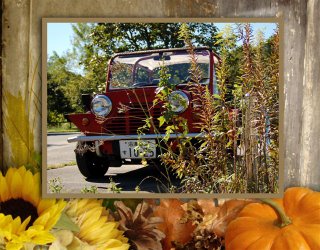
Love the work you did with the car and pumpkins.
We are looking forward to seeing what you can do with your new toy too!
Post a Comment